CNN Europe TV changes appearance

by Arthur
Posted on Saturday, February 11th, 2006 at 10:40 am CET
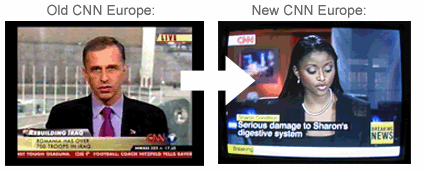
CNN Europe today changed their TV look. The familiar American red and blue interface has been replaced by a much more British, simple, boxy look.
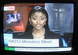
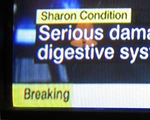
The CNN logo has been moved to the top-left corner of the screen with a white background, and the bottom of the screen is dominated by large yellow and black squares with bold text. The bright sharp colors remind me of U.K. channels like Sky News and BBC News.
The new scrollbar doesn’t scroll anymore; instead sentences just appear and disappear. This, and the way headlines flash on and off on the screen is very distracting. So far I don’t like this new look at all; let’s hope this is just a big mistake and they will change it all back tomorrow.
Related article: Confusing news ticker on Fox News
CNN Europe today changed their TV look. The familiar American red and blue interface has been replaced by a much more British, simple, boxy look.
The CNN logo has been moved to the top-left corner of the screen with a white background, and the bottom of the screen is dominated by large yellow and black squares with bold text. The bright sharp colors remind me of U.K. channels like Sky News and BBC News.
The new scrollbar doesn’t scroll anymore; instead sentences just appear and disappear. This, and the way headlines flash on and off on the screen is very distracting. So far I don’t like this new look at all; let’s hope this is just a big mistake and they will change it all back tomorrow.


Related article: Confusing news ticker on Fox News


12:37 am
PLEASEEEEEEEEEEEEEE GET RID OF THE RGRAMMER SCHOOL SQUARES ON YOU TV NEWS.
NANCY GRACE IS GREAT, DOWN TO EARTH, EMPATHETIC. SWEET SPIRIT AND A BEAUTIFUL CHILD OF GOD. LETS SEE YOU PRINGT SOMETHING WITH GODS NAME IN IT.